120 Stunning Color Combinations For Your Next Design
120 Stunning Color Combinations For Your Next Design
Posted on 9 November, 2016 - Last Modified on 16 January, 2017
Your choice of color combinations can make or break your design project. Applying the right color combination to your project can be a great way set the mood and tone for your designs, whether it be on business cards, logos or icons.
However, it’s not always easy to decide which color combination to feature in your designs for the message you want to convey. We’ve made this decision easier for you by putting together 120 stunning color combinations that can help you set the right tone for your next design! The best part? They’re all absolutely free to use!
Destinations
1. Sunset Glow

Shutterstock/ Mark Harpur
It’s hard to beat the spectacular color palette that a sunset creates. In this color palette, the fiery orange of the sun setting on a beach in Mexico adds a stunning contrast to the subdued purple of the sky and reflection on the sea. It’s the perfect color combination to use when you want to add vibrance to your designs.
2. Purple Skies

Shutterstock/ Vincentiu Solomon
This eye-catching image, taken in Cima d’Asta in Scurelle, Italy features a range of purple tones and black edges, creating a subdued and sultry tone. The defined white streak of the shooting star adds a contrast to the softness of the colours in this palette, a perfect sultry combination.
3. Restrained And Cool

Unsplash/Jeff King
The combination of dark ash grays and grayish blues creates a color palette that is restrained and cool. The darkness of this scene in Kula, United States is relieved by the shades of red in the centre, the touch of green in the foreground and the blue sky in the background. This color combination is perfect for a somber design theme.
4. Pebbled grays

Unsplash/Jeremy Cai
The pebbles strewn across in various shades of gray, brown and black create a rough yet restrained texture in the foreground while the foamy water in the background adds a soft contrast to the scene. This color combination is versatile and can be applied for a wide range of projects, ideal for website design.
5. Flaming and fiery

Unsplash/dade72
The white hot rays of the sun highlight the flaming and fiery sand colors in Monument Valley. The golden sand shimmers in the blazing sunlight while the few stone sculptures provide some relief to the otherwise stark landscape. This color combination is ideal for bold and warm designs.
6. Cool River Blues 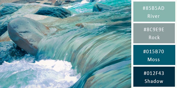
Unsplash/ Leo Rivas-Micoud
This color combination pictured in Tsunan, Japan, is a classic example of a monochromatic color scheme. Every element, from the flowing and swirling waters to the rocks in the background feature different shades, tones and tints of aqua blue. It’s the perfect color scheme to use when you’re after a cool color combination.
7. Moss watery greens

Flickr/Moyann Brenn
The color combination featured in the little waterfall of Cascate Del Monte Gelato in Italy, perfectly encapsulates the dramatic contrasts found in nature. The varying shades of green, from mossy green to dark bottle green add a certain coolness to the brilliant blue shades and the subdued patch of brown. This is color combination is perfect for any daring and bold project.
8. Earthly and Natural

Flickr/Moyann Brenn
The contrasting interplay between the brown rocks and green trees makes for a stunning natural scene in Bryce Canyon in Utah. In a brown and green color scheme, this color scheme is both natural and earthly. This color combination makes for a warm palette in any design.
9. Bold and Strong

Flickr/Paul Bica
The use of primary colors in this shot of Napali, Hawaii, gives the image a bold and strong appearance. Applying the primary colors of red, blue, yellow and green adds for a unique touch to your designs. The primary color wheel is often used in business branding for a reason – they are often perceived by consumers as representing confidence and trust.
10. Bright and Fresh

Flickr/ Mirai Takahashi
A row of pretty dark pink flowers atop long light green stalks is reminiscent of the new beginnings that spring brings. The color combination is feminine yet bold. Taken in Hitachi Seaside Park, Japan, this image features the perfect color combination for a fresh and bright design.
11. Faded

Shutterstock/ Creative Travel Projects
The use of faded tones of greens, reds and yellows creates a light and calm color combination in this shot of a mountain lake in National Park High Tatra. The sun peeking above the trees in the distance provides the only clue that the shot was taken early morning before the hustle and bustle of the day begins. Using a retro style filter will help you achieve this look for any image.
12. Colourful Vibrance

Shutterstock/Olga Gavrilova
The use of vivid colors in these houses in Burano Island near Venice, Italy, makes this an eye-catching palette. The combination of sunny yellow, candy pink, burnt orange and lavender adds a bright freshness that gives the scene a playful look. It’s a fabulous choice of colors when you want to give your project a fresh and youthful look.
13. Misty Mornings
 Shutterstock/Sazali
The sheer simplicity of the scene in Nagalang, Labuan features the perfect combination between warm and cool colours. The light orange skies cast a serene glow over the still blue waters that surround the lone brown house-on-stilts in the distance. It’s a beautiful color palette for depicting serenity, simplicity or minimalism.
14. Sunrise

Shutterstock/ Dancestrokes
The color scheme in this early morning sunrise in Coronado Island, San Diego, USA is calm, cool and inviting. The azure blue skies are tinged with a warm coral tint that hints of sunrise. This colour combination is feminine and perfect for soft and neutral designs.
15. Floating Ice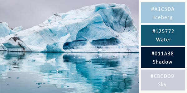
Shutterstock/ Shaiith
Varying shades of cool, glacial blues dominate this shot of stunning icebergs floating on the lake in Iceland. With this choice of colors, nobody can mistake the message you are trying to convey in the shot. Use this monochromatic color scheme when you want to express visions of minimalism, peace, serenity or icy coolness.
16. Vivid Sunlight
 Shutterstock/ Creative Travel Projects
This combination of vivid colors breaks the all-white that typically dominates winter scenes. The dark, dramatic oranges and yellows of the sun set in the background give this winter scene in Ukraine a fantastic energy and vitality, perfect for any bright project.
17. Spring Blooming

Shutterstock/ Andrew Mayovskyy
The carpet of pink blooming rhododendron flowers adds a bright, colorful touch to an otherwise subdued background in the Carpathians. It’s a perfect palette of colors when you want to illustrate ‘the calm after the storm’ for a light design feel.
18. Fresh and bright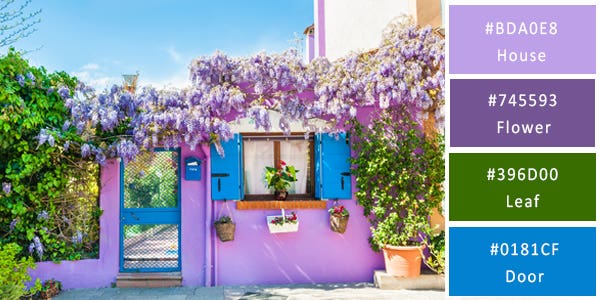
Shutterstock/Olga Gavrilova
An abundance of magentas in a wide variety of shades interspersed by bright blue accents and flanked by greens makes this an unconventional color palette. Shot in Burano Island near Venice, Italy, this an excellent choice of colors when you want to feature femininity and bold colours in your designs.
19. Frosty Winter
Shutterstock/elen_studio
The sparkly white of this frosty winter scene adds a cool touch the image. As it is, the choice of colors and effects in this winter scenery in a city park adds the perfect magical touch to any of your projects.
20. Sky meets water
Shutterstock/ Evdokimov Maxim
The soft setting sun bathes the entire sky in this Maldives peachy glow, creating an orange horizon where it meets the emerald green lagoon. The brown facades of the overwater bungalows act as a perfect foil between the orange skies and the shimmering green waters. This color combination is perfect for any warm design palette.
21. Cloudy
 Shutterstock: Arlo Magicman
The medley of colors in this Kuwait city landscape range from moderate orange and pink to grayish orange accented by bright yellow flecks in between. This colour palette is perfect for a darker design colour scheme.
22. Autumn glow

Shutterstock/ Sunny Forest
Nothing says autumn better than golden and rust colored leaves. The color palette of this autumn landscape has almost every color of the season - rust, gold, brown, green and yellow. Choose from these colors for your next project for bright yellow colour combinations.
23. Crispy Mornings Shutterstock/Luciano Mortula
The interplay of browns, blues and shell pink create a relaxing color scheme in this scenery of Adige River and Ponte di Pietra in Verona, Italy. It’s the perfect palette of colors to choose from when you want to project warmth, peace and harmony in your designs.
24. Timeless

Shutterstock/ Romas_Photo
Blue skies and white clouds are separated from the shimmering emerald waters by a unending row of old houses in this colorful image of a canal in Venice. The light colours are ideal color combinations for your website or blog.
25. Coral Tones 
Shutterstock/ Brian Kinney
Shot in the Red Sea in Egypt, a medley of vibrant colors brings this underwater scene to life beautifully. The deep, rich blue waters in the background act as a beautiful foil to the range of bright colors in the foreground. This color combination is perfect for any creative project.
Nature and Flora
26. Oak and Ash 
Flickr/let ideas compete
Even a pile of fallen leaves can make for a great color combination. Fallen leaves in a range of browns interspersed with in oranges, greens, reds and yellows makes for a shot that is rustic and colorful. Give your rustic projects a touch of color with this gorgeous palette.
27. Peachy roses
Flickr/jay
Looking for an impactful color palette? This color combination features a bright mix of greens and warm reds, providing a great energy to your project. The playoff is perfect for a fresh touch to any design that is natural and bright.
28. Pretty and Pink

Unsplash/ Mona Eandra
Are you looking to add a feminine touch to your designs? A bunch of flowers colored in various shades of pink is unmistakably feminine. A light combination of the various shades from this pink palette will help you add the a bright touch to your designs.
29. Shades of green
Flickr/Reflected Serendipity
The different shades of green found in this plant in Oasis, Sussex adds a refreshing and calming touch to any project. This fresh foundation is a great color combination for any bright and clean design.
30. Subdued and subtle

Flickr/Juan Rabiano
The foaming waterfall creates a starkly dramatic contrast to an otherwise subdued and subtle scene. The Autumn season is evident in this color combination with shades of brown, orange and yellow.
31. Shades of Blue

Shutterstock/Annmarie
The medley of light blue petals with their strong blue outline gives the shot a look that is cool and prominent. It’s the perfect color scheme for a design project that makes a strong impact with different shades of blue.
32. Vibrant and Fresh

Shutterstock/ allstars
A bouquet of tulips features a color palette with a variety of vibrant yellows, purples, reds and, greens. If you want to achieve a look of summer freshness in your next project, choose any combination of colors from this palette or use them all!
33. Sunny Yellow
 Flickr/Sara McLeod
These flowers feature multiple shades of yellow that add a sunny and bright feel to any design. Use these vibrant yellows to add a burst of energy to your project. Choose to combine it with the darker yellow and orange tones to add contrast to your designs.
34. Forest greens
Shutterstock/Ruslan Ivantsov
Looking for colors that will help emphasize your environmentally friendly mission? A color palette consisting of leafy greens and woody browns will help you achieve this vision. Include only dark greens and browns if you are going for a subdued look. Add a touch of lime green to the design if you want to brighten things up a notch.
35. Fiery oranges

Flickr/ albadros1
This spectacular color combination of bright yellows and fiery oranges reflects the colors of the sun setting on a bright and cloudless day. Use this color combination for your design projects if you want to add an energetic and bold touch.
36. Spring Pastels 
Shutterstock/ Anna-Mari West
The bouquet of spring tulips in pastel shades depicts grace and femininity. The vintage vase and background in different shades of light blue adds to the pastel palette. Choose this color combination if you want your design project to evoke a sense of femininity and grace.
37. Bold Purples
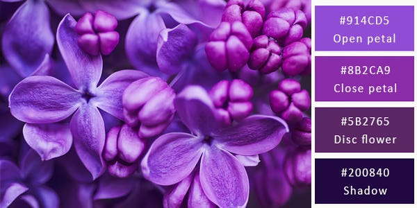
Shutterstock/ Roxana Bashyrova
Crisp purple hues compliment each other beautifully in this superb monochromatic image of spring lilac violet flowers. The lighter shades of purple act as a perfect counterfoil that highlight and accent the deeper, darker violet tones.
38. Tropical

Shutterstock/Fotozotti
Tropical colors are showcased beautifully in this colorful wedding bouquet of summer flowers. The combination of oranges, pinks and greens is unmistakably tropical and the wooden container gives the entire scene a look that is rustic and colorful.
39. Pink Blossom

Shutterstock/iravgustin
Pink blossoms herald the beginning of spring. Applying this color palette to your designs is a great way add softer shades of pink that suggest femininity. Browns sprinkled within the sea of pink blossom will give more character and depth to an otherwise all-pink scheme that can be overpowering.
40. Asian inspiration

Shutterstock/Evgeny Atamanenko
A black ground interspersed with scarlet creates a vivid two-toned color scheme that is stark and stunning. This is the perfect color combination for your branding needs and adds a dramatic contrast that is sure to get any customers attention.
41. Shell shades

Shutterstock/Olleg
Are you looking for a bright color combination? The soft off-whites, pinks, beiges and purple colors of these shells are versatile and can be used for a light and soft touch to your design projects.
42. Mother of Pearl

Shutterstock/ Lost Mountain Studio
The shimmering peach and light green pearls on a mother of pearl shell is an opulent choice of colors. Use this color scheme for a design that suggests elegance, sophistication and luxury - a magical touch for any project.
43. Blossom

Shutterstock/ pavelgr
This all-pastel color scheme is soft and gentle. Pastel shades work wonderfully for designs that aim for a refreshing touch. This color combination is perfect for invitations to special events and baby showers.
44. Mushroom browns
 Shutterstock/ bikeriderlondon
Are you looking to add an organic touch to your designs? Earthy browns and greens can be a great way to bring out natural color combinations in your project. Add a darker color for contrast to make your color palette pop from the page.
45. Dandelion

Shutterstock/ Brian A Jackson
Are you looking for a dark color palette for your next design? This colour combination adds a darker touch to any project. The combination of browns, greys and blacks can be a great dynamic to your website, blog or business card design.
Animals
46. Classic colour wheel
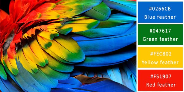
Shutterstock/ Super Prin
The combination of deep, rich blues complemented by vibrant yellows, fiery red and specks of green creates a rich color palette that exudes happiness, energy and exuberance. These blend of colours are a great choice for your branding and design needs.
47. Leopard print

Shutterstock/ Ondrej Prosicky
The leopard-like combination of the orange, yellow and black colors are commonly seen in fashion for color schemes such as that of shoes. However, Leopard prints are also extremely eye catching on their own and this colour combination can be used for other purposes such as to complement a rainforest conservation site or perhaps a logo for a zoo program.
48. Butterfly Tones

The exotic colorations of the butterfly with its varying shades of yellow, from a soft to a bright tinge contrasts effectively with the pale, blue from the opposite end of the colour circle. This is a wonderful color palette to use for an outdoor scenery to add a gentle tone of happiness.
49. Lime greens

Flickr/Rushen
The vivid green of the frog is almost the same color of the leaf that it has settled upon. The difference between the two is the contract in the slight change in shade that affects the textures. This is a perfect example of how to use textures to create drama in a scene comprised of one color scheme.
50. Light and Airy

Flickr /Ricky Kharawala
What do you imagine when you think pink, airy and light brown? I can imagine a nice warm cappuccino sitting right in front of me. The light brown froth, the little white, pinkish heart shape, smoothly integrated into image creates a soft sweetness.
51. Cool Tones

Unsplash/Steven Diaz
The medley of cool tones with the smoky grey veil gives the shot a sense of peace and serenity. The soft brown, seen in the the monkeys, add little blobs of color to an otherwise monochromatic color scheme. It’s a great choice of colors when you want to depict quiet solitude or even mystery.
52. Starlight

Flickr/Jonatan Pie
Purple and white is a match made up in heaven. More specifically up far out in space. With the black from the arctic fox's eyes you got the darkness of space, the purple is one of the many colors you see in nebulas and the white is the speckles of stars. It's a perfect palette for a lovely composition of space!
53. Crisp and Fresh

Unsplash/Boris Smokrovic
This is an absolutely gorgeous and versatile combination of colors. The brilliant orange dominates the shot and is highlighted by shimmering green and the kingfisher’s long brown beak. This combination works well together and creates a crisp and clear finish to the imagery.
54. Golden locks

Flickr/Caleb Fisher
The golden browns of this colour scheme creates a lovely sense of peace and serenity to the imagery. The varying shades starting at a soft pink tone to the darker brown shadow creates charm without unnecessary contrast and colour domination.
55. Monkey Business

Unsplash/Quentin DrIndonesia
The muted color scheme of this palette conveys a sense of quiet serenity. The ash gray dominates this combination with the brown tinge adding unexpected highlights. Complementary shades of gray and brown help enhance any imagery beautifully.
56. Cozy Warm Tones

Unsplash/ Pedro LastraMiami
The medley of browns is deftly accented with the soft purple, which adds a touch of flavour and royalty to this palette. These pastel colors complement a range of other colours as seen in the addition of the yellows and whites of the flower in this image.
57. Basics

Flickr/Andy Chilton
The range of grey is accentuated by the soft yellow, which adds a touch of pure happiness. The gray helps to highlight the freshness of the yellow, as seen in this image. This is a great color combination to show freshness, purity and simplicity.
58. Warm and Natural

Flickr/ Phil Long
Who says brown is boring? Far from it. The rich, dark, chocolatey background forms the perfect foil that highlights the light browns of this palette, demonstrated in the rabbit. This color scheme is rich, warm and comforting and perfect for both a warm nature based scene or on the other side a welcoming cafeteria.
59. Aqua greens

Flickr/ Jeremy Bishop
It’s hard to imagine another shot that so aptly illustrates a beautiful range of aqua greens. The green progresses from a light, shimmering aqua shade to a deeper, darker shade of green. Right in the middle the scene is a olive green turtle that floats along playfully adding a spark of colour. This colour scheme makes for a beautiful color combination to depict marine or acqua settings.
60. Tropical

Flickr/ Pineapples
This combination of neutral colors is versatile enough to be used in several different design projects. Choose one or two colors from this palette to create the main background and add accents using the other colors to create a look that is sophisticated yet comfortable.
61. Comfy

Unsplash/ Matthew Wiebe
Monochrome? Yes. Boring? No way. This is a brilliant example of how to use tints and shades in your work. This image is composed exclusively of browns but in shades that range from tan and chocolate brown to light beige and neutral white. This variety of the brown shifts your thinking from "why is there so much brown" to "wow all those browns look lovely". Plus you can't ignore the adorable puppy.
62. Organic and Neutral

Flickr/ Victor Jakovek
The color palette used in this shot is perfect for use in any design project that involves birds of prey, wildlife, nature or the desert. The orangey-brown, ash gray and opaque green coloration contrasted effectively with black will works well to create a fantastic background for projects based on a nature theme.
63. Chocolate Browns

Flickr/ Julia Janeta
Looking for a neutral color scheme that you can use in multiple projects? Check out the range of browns and blacks used in this shot. The earthy overtones of this combination, complement each other and add a warm tone to the image.
64. Sober Tones

This colour scheme, represented by the lone seagull, creates a sense of subdued drama with the strong contrast between the black and yellow tones. The colours adds emphasis to the image, and like we see in this picture, add a warm tone to the cool colours of the ocean.
65. Trinidad and Tobago

The shimmering greens and blues are colors that any fashion designer would go gaga over. The bright, sparkly blue and green are underscored by a deep, shimmery purple that complement each other effortlessly. These colours come together to create the ideal combination for a loud, shimmery and individualistic style.
66. Exotic Coconut

Flickr/ Shaiith
Nothing says tropical fun better than this colour combination, and a pinacolada drink with mint served in a fresh coconut. The yellow pineapple wedge adds the perfect finishing touch and pop of colour to this fun combination. If you’re looking for earthy tropical colors this colour scheme has the perfect colors for your design - brown, white , green and pineapple yellow.
67. Yellows

Flickr/Michael Stern
A cheese tray provides the perfect inspiration for anyone looking to use a palette of yellows in their next design project. The combination of bright and light yellows gives any scene a delightfully refreshing and happy look.
68. Submerged Citrus

Flickr/Michael Stern
This medley of vivid reds and oranges is the perfect combination for a Citrus Sensations. The solid light-colored blue adds a soft tone to the combined colours without conflicting or detracting from the other bright colors. The sharp reds in this palette provides the right degree of contrast with the white rind and yellow peel.
69. Summer tones

Flickr/ Michael Stern
This tropical colour combination evokes a warm summer vibe. The soft shades of these normally bright colours effectively complement each other and add impact to the palette. Like you can see in this picture, the addition of the foam colour and the gleam that covers all the elements of the image makes it look unmistakably refreshing.
70. Macaroon Pastels

Flickr/ Michael Stern
This colour scheme uses both contrasting and complementing colours to create an inviting and delicious combination. With a color scheme as varied as this, you can be sure there will be something for everyone. This is a perfect color palette for a pastry or ice-cream outlet.
71. Fruity

Flickr/Michael Stern
This colour scheme is ideal to add a fresh and fruity tinge to your work. The apricot and bottle shade is offset by the shades of green and will give your shot a sense of vitality and lusciousness tinged with freshness.
72. Ice cream browns

Flickr/ Michael Stern
This monochromatic combination of warm brown tones is excellent for themes related to the rich decadence of cocoa, coffee and chocolate. The range of brown shades from a lighter tone to a darker one adds warm variation. You can use this color palette freely without worrying about overkill. Just like coffee and chocolate, you can never get enough of it.
73. Strawberry Sensation

Flickr/ Michael Stern
This color palette, with so many vibrant reds interspersed with dark purples and a soft browny-orange, represents sweet indulgence. This is a gorgeous color combination for a pastry chef or any little girl who's not into the stereotypical "girly pink". The colour of the cake and the dark blackberry offset that red richness to ensure that it isn't overpowering.
74. Blueberries

Flickr/ Michael Stern
From dark midnight blue to lighter indigo ink and even lighter periwinkle, a snap shot featuring only blueberries demonstrates a gorgeous medley of blues. With the addition of a sprig of green leaves and a hint of brown in the shot, the blue is balanced out but maintains its spectacularity.
75. Cherry reds

Flickr/ Michael Stern
This colour palette is ideal for a representation of modern Christmas colours. As you can see in this image, the combination of deep red cherries with their green stalks nestled in a soft green bowl creates a well complemented blend. You can use just these three colors in various combinations to create an endless array of fabulous Christmas scenes.
76. Frosted

Flickr/ Michael Stern
From the deep dark brown of the chocolate to the rich red of the strawberries to the gentle cream coloured sugar dusted upon the dessert, there is nothing about this image that isn't inviting. All the warm rich colors complement each other and just make me want to tuck in. Who can say no to chocolate and strawberry?
77. Fiesta

Flickr/ Michael Stern
This refreshing color palette includes a wide range of colors that complement each other beautifully. An abundance of light brown with dollops of red, light green, dark green and yellow sits atop a clear glass plate of soft grey that supports the medley of colors without overshadowing them.
78. Summer Vibes

Flickr/ Michael Stern
The combination of varied shades of red and white make this a welcome sight that is reminiscent of summer. Use this color palette with restraint to add a burst of fresh color to your summer event posters or to give your scene a fresh and youthful look.
79. Glazed

Flickr/ Michael Stern
The rich luscious decadence of this shot is unmistakable and effectively enhanced by this colour palette. The shades of red dominate the scene from the fillings to the outside of the tart but it stops short of being overpowering. This is the perfect color combination to use for a pastry shop project or for a design that depicts passion and lust.
80. Painted

Flickr/ Michael Stern
From luscious reds and juicy greens to fresh yellows and refreshing oranges, this colour palette evokes bright and lively imagery. You can use any of these colors in any combination to create scenes that depict health, vitality, nutrition and overall fitness.
81. Warm Amber

Flickr/ Michael Stern
This is yet another excellent example of a monochromatic color palette that is breathtaking in its simplicity. A light toffee colored center is flanked by richer shades of the same colour and accented by both, a darker shade of amber as well as a lighter shade that is almost white with tints of toffee. It’s a refreshing, neutral palette that is versatile for many purposes.
82. Fluro
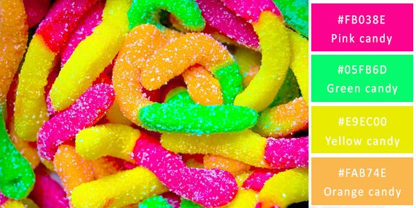
Flickr/ Michael Stern
This happy color palette is an epitome of fun and gaiety. There’s nothing somber, sedate or serious about this combination. Are you looking to design a summer party invitation or a child’s birthday party invite? Let the fun begin with invites in this bright-colored palette.
83. Jazzy and Jeweled

Flickr/ Michael Stern
Red tends to be a very dominating color especially since it can be such a warm color. This image clearly demonstrates how even a slight contrasts in the colors in a composition can provide it with a much needed relief. This is clearly shown in this image as the mint green leaves and soft silver stand out against the red.
84. Splashy

Flickr/ Michael Stern
Different shades of brown dominate this scene, which act as a perfect enhancement for the bright purple and pink or the flower and pipe. The bright colours provided by the purple straws add a splash of pink petals in the foreground add colorful relief to the palette and bring life and fun to the combination.
85. Tinted

Flickr/ Michael Stern
This punch of orange is just what you need to bring a bland, boring scene to life. Orange radiates warmth and happiness and if you are looking to add excitement to a monotonous gray, brown, green or blue shot that needs a little something extra, a splash of orange will make a difference.
86. Washed Out

Flickr/ Michael Stern
Ripples and swirls of raspberry red add delicate tints of color in this beautiful image. It’s a color combination that’s made in heaven for a wide range of design projects especially those that are aimed towards a more feminine audience. It’s a color scheme that’s cozy, comfortable, rich and delicious all at the same time.
87. Vibrant and Summery

Flickr/ Michael Stern
This shot is an epitome of rustic Italian cuisine. The dark contrast acts as the perfect rustic counterfoil to the cheerful, bright yellows, reds, greens, purples and whites. Choose from this color palette for your next cooking project and add colourful life to the food depictions.
88. Faded tones

Flickr/ Michael Stern
The color scheme in this shot is distinctly mediterranean, with its combination of olive green, the darker green of the thyme leaves the milky creaminess of goat cheese served on a pink platter. These soft colours of pink and green are found on opposite ends of the colour wheel, but their gentle tones work well together.
89. Splashy

Flickr/ Michael Stern
A tray filled with berries atop a base of sliced citrus fruits creates a colorful palette of bold colors that can be used to liven up any design. Despite the contrasting hues they all work together beautifully. Use them all together or just pick a couple of colors to infuse your next project with a touch of brightness.
90. Sombre
 Flickr/ Michael Stern
A color palette of chocolate browns and white oozes decadence evoke comfort and luxury in equal measure. This combination of colors can be used to depict all of the above features. The neutral color scheme allows these colors to be used by themselves and also to be added to any other color scheme. The lighter colors of this palette tone down the overall effect whereas the darker shades add distinct drama and highlights.
91. Cherry combination

The cherry red, seen in this image, adds loads of color and drama to an otherwise cool shot of peach ice cream. It’s the perfect example of how to use only a dash of deep dark colors to accent your design beautifully without overpowering it or hogging the attention.
92. Coffee

Flickr/ Michael Stern
This neutral palette of colors, ranging from white and light grey to deeper and darker browns, is super versatile. It can be used for a wide range of design projects, from those that focus on cool compositions to those that focus on warmer, rich, foamy cappuccinos.
93. Flaming Reds

Flickr/ Michael Stern
This predominantly red based colour palette uses a softly contrasting creamy-brown colour to add another dimension to the composition. The overpowering reds makes this colour palette ideal for images evoking lust and passion and will add power and energy to any project.
94. Fresh Watermelon

Flickr/ Michael Stern
When you think of the combination of red, green and white, you can’t help but imagine scenes at Christmas time. But red, green and white - the traditional colors of Christmas can also be used to convey the luscious refreshment that a slice of watermelon provides and add summery feels to the image.
95. Outdoor Relaxation

Flickr/Michael Stern
This colour palette presents perfect colors to complement a beach scene. The cool color palette of this image with its soft greens and gentle greys work together in harmony and can be applied to almost any calm composition.
96. A Rio Touch

Flickr/ Roderick Eime
The imposing Christ the Redeemer statue stands tall in the foreground and dominates the scene that is otherwise composed of a variety of vintage blues, greens and browns. The light green stands in stark contrast to the muted colors of the background. This is a great color scheme for a vintage scene.
97. Violets
 Copyright/ Ronnybas
The soft purples, the complementing blue and the contrasting black creates a mystical colour combination. The view of this charming town of Positano on the Amalfi Coast in Sorrento Italy uses the colours of this palette to add a magical tone to the buildings located on the hill.
98. Retro style

Shutterstock/ Michal Bednarek
Red is one of those colors that can brighten up the dullest of compositions as it has done in this colour palette. The blur of the red buses, seen in this image, adds a vivid punch of color to the vintage, retro style scene composed of browns, grays and blues.
99. Neutrals in Italy

Copyright/ Prochasson Frederic
This colour palette ideally depicts, warm, stone influenced imagery, typical of a vintage european seen in the above shot. The addition of green provides colorful relief to the range of browns and greys of this palette and scene in the shot of the colosseum.
100. Harmonious tones

Shutterstock/ Krunja
This heavily warm colour palette, successfully depicted in the The Marble Temple of Bangkok in this image, is ideal for summery and tropical tones. This palette can be effectively contrasted with cool blues and provide relief to the image.
101. Canal in Venice

Shutterstock/ g215
This colour palette complements the romantic scene of the canal in Venice. The combination of water based colours with the contrasting cream and black, creates cool tones. In the image, these colours create a gentle flow in the water with the seemingly slow movement of the gondola and effectively complement the delicate, soft brown of the buildings.
102. Modern Inspiration

Shutterstock/ S.Borisov
Purple, typically a royal colour, brings importance to this colour palette and enhances the cool shades of blue. In this shot of St. Peter's cathedral in Rome, the purple glimmer that lays over the structures helps add a sense of superiority to the cathedral. The soft gradient from blue to a soft purple-brown colour, ties the palette together perfectly.
103. Pales and Navies

Shutterstock/ Sabino Parente
The marble columns of the Suleymaniye mosque along with its pale blue domes presents a palette that is so cool it could almost be freezing. These colors are befitting for any arctic or ice composition. Despite being dominated by shades of blue, this image showcases how well it works and how gentle they can be.
104. Dusty

Shutterstock/ Fabio Lamanna
This image of a terraced salt pans of the Cusco Region in Peru uses a white and brown color palette that is extremely versatile. It can be used for a wide range of design projects, from the trees and snow of an arctic forest to the coffee and whipped cream of a Starbucks frappe. Think chocolate, coffee, snow, ice. So many combinations with two simple neutral colors.
105. Classic and Dark

Shutterstock/ Dennis van de Water
This snapshot of Pont Alexandre III and Les Invalides in Paris at sunrise brings out a color palette that is subdued and restrained. You can choose from the black and gray combination in the foreground or the pale cream in the background. In both cases, you can accent the whole effect with a dollop of bright orangey colour strategically placed.
106. Delicates

Shutterstock/ S.Borisov
This autumn based colour scheme is emphasized by the yellow buildings and pale blue sky. The browns and greys are soften by the blue and yellows. Despite, typically being bright colours, this palette uses a duller tone of each colour to create a gentler combination. To enhance this style, a retro filter can complement these colours and help create the ultimate retro look.
107. Mellow And Warm

Shutterstock/ iascic
The warm and earthy tone of this old city street in Croatia makes the viewers feel like they are looking at a place untouched by modern technology, a place still rooted in its culture. The browns and reds, with their varying tones, truly showcase how monochromatic palettes aren't necessarily dominating but rather complement and enhance the imagery.
108. Sydney Blues

Shutterstock/ Taras Vyshnya
These deep blue colour palette suits a variety of themes from water based projects to night life, as depicted in this image of Sydney. Although the blues themselves may not seem dark, their contrast with the specks of bright yellow light brings it out. The smooth shade changes of the blue creates a gentle and soft feel to the colour scheme.
109. Festive

Shutterstock/ Sean Pavone
The bright red and emerald green Oriental structure stands in stark contrast to the muted gray of Mt. Fuji in the background. The soft brown of the pagoda wall offers colorful relief. The colors in this palette are quintessentially oriental and are ideal for any oriental-focused design project.
110. Cherry Blossom

Shutterstock/ Nonthachai Saksri
Colors like the gentle purple of the cherry blossom tree as well as the jade green and brown of the castle create the perfect color palette for any oriental art. The palette can lend itself to both oriental fashion as well as more traditional painting.
111. Versatile

Shutterstock/ RuthChoi
This soft colour palette of greens and browns, creates a gentle relief to any project. This suave combination of colours works well against any other colour scheme as seen in this image contrasting against the vibrant green. The green and brown combination is versatile and can be used freely in any design.
112. Authentic

Shutterstock/ CHEN MIN CHUN
The use of contrasting colours with the blue and red create a strong effect and enhance the value of each individual colour. This is an ideal color palette if you are looking to recreate an authentic waterfront scene as seen in this classic waterfront scene of the Tamsui River in Taipei, Taiwan.
113. Unconventional

Shutterstock/ apiguide
This powerful sunset, effectively using the superior nature of the soft purple within the palette casts contrasts dramatically with the bright green. This resultant scene at Wat None Kum in Thailand offers plenty of unexpected unconventional color combinations that you can choose to use for your next design project.
114. Medieval

Shutterstock/ Boris Stroujko
Just this one shot encapsulates the charm and colors of this German city, successfully using blues, yellows and browns to create suave and complementing imagery. If you’re looking for medieval colors for your design, there are plenty to choose from in this charming color palette.
115. Contrast

Shutterstock/ TTstudio
This palette allows you to choose from a palette that consists of soft shades of light and dark blues and bright and soft blues and browns. The integration of the brighter blue and brown colours will add spark and flavour to any scene.
116. Dimmer tones

Shutterstock/ vichie81
A shot of the traditional colorful houses alongside the canal in Colmar, Petit Venice highlights this charming palette of colors. The darker shades of each colours made this palette ideal for dimmer scenes that will contrast well with light, bright colours.
117. Rich and Magical

Shutterstock/ Krunja
The rich, opulent gold of the Shwedagon pagoda dominates the midnight blue skies over Myanmar at night. The red lanterns dot the sky contrasting effectively with the dark colour and create a spectacular effect. Rich gold, midnight blue and burnt orange is the classic combination to use when you want to depict royalty.
118. Mellow And Dark

Shutterstock/ Kanuman
The importance of balance is so explicitly captured in this colour combination seen in this shot of Istanbul in Turkey. The dark midnight blues would have dominated the shot if not for the warmth of the light of the Mosque Wall that catches the attention of the viewer.
119. Bleached

Shutterstock/ Leonid Andronov
Nothing says regal more than the color gold which is the first thing that strikes the viewer in this shot. It is a fitting color for the Golestan Palace in Tehran Iran and a great addition to this colour scheme, alongside it strong orange. The gold is complemented by a vibrant green that gives the palette a natural relief, which is reinforced by the dull blue.
120. Bright And Flamboyant

Shutterstock/Mikadun
The medley of colors highlights the colorful nature of the people of Medina of Chefchaouen, Morocco in Africa. There’s nothing shy about the colors. Bold blues, bright red and a soft green and pink add charm to any imagery without clashing or looking garish. This colorful palette is ideal for infusing a sense of fun and gaiety into any design.
https://www.freelancer.com/community/articles/120-stunning-color-combinations-for-your-next-design


Comments
Post a Comment